NEwera doula:
brand book & logo Design
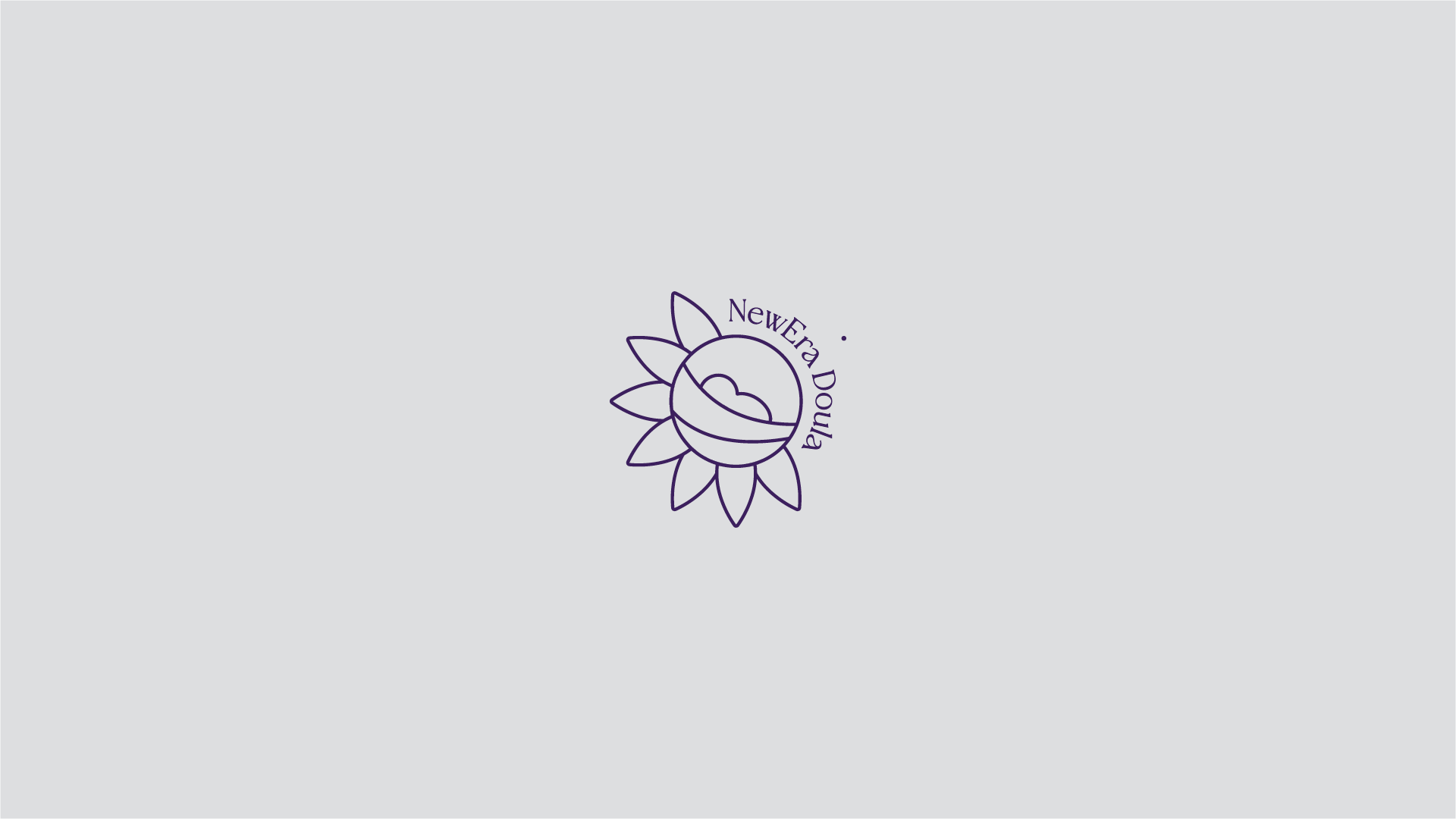
In the spirit of bringing together everything that a doula can support, we have decided to bridge two elements that encapsulate this idea. The first is an abstraction of a newborn being cradled by their family. The second element is the encompassing of the petals of a sunflower, symbolizing hope and warmth.
The name is integrated into the logo, enclosing the circle that otherwise would have been completed by the petals. The number of petals is seven, symbolizing intuition, wisdom, and growing self-awareness, which are some of the qualities that a doula provides.
Finally, we played with the idea of playing with the stroke of the forms and decided on a light stroke that makes our logo legible, while simultaneously making our logo distinguishable for our target market.